The short answer: measured light, translated colors
James Webb Space Telescope images have color because image specialists translate measurements of mostly invisible infrared light into visible colors. The observations are not simply an ordinary color photograph sent home from space. NASA's Webb FAQ explains that the observatory covers infrared wavelengths as well as a small portion of visible light. A finished image can therefore reveal information that your eyes could not perceive directly, even if you could travel to the scene.
That distinction makes two common reactions unhelpful: assuming every image shows exactly what an astronaut would see, or assuming any color assignment makes it invented. A better question is what the published version represents. This guide gives you a way to answer that question without pretending to perform astronomical research. Keep the original image page open as you read. Its caption is part of the explanation, not an optional accessory to the picture.
Start with the detector, not the wallpaper
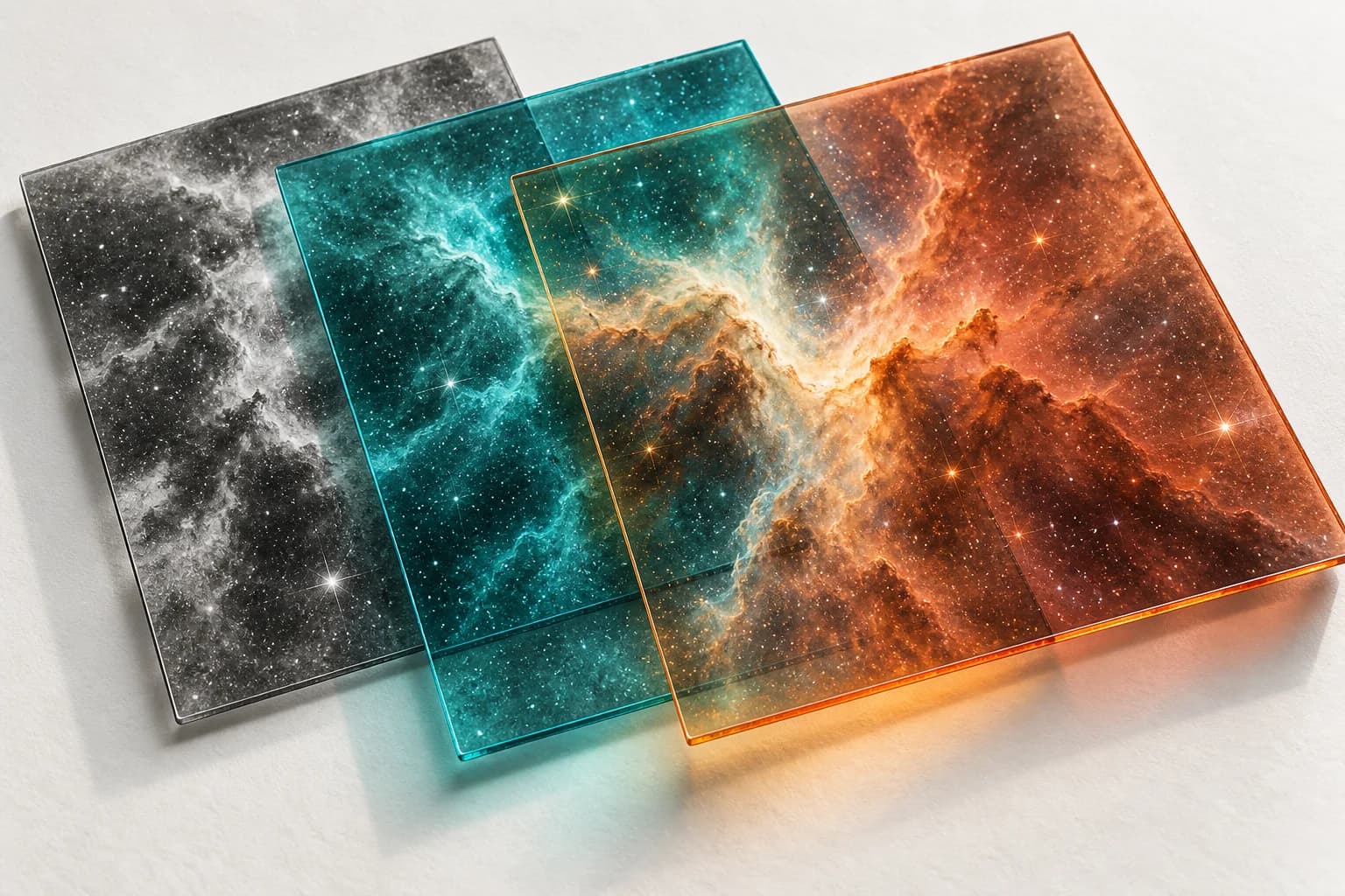
According to ESA/Webb's image-processing guide, an individual frame records light collected by a detector and is initially displayed in grayscale. Filters restrict the wavelengths admitted during an exposure. These separate measurements can be aligned and combined; several observations can also contribute to a larger mosaic. The final composition is therefore often assembled from multiple inputs rather than captured in one exposure through an ordinary camera lens.
For a reader, the useful habit is to separate the object, the observation, and the presentation. The object is the thing being studied. The observation specifies which light was measured. The presentation determines how those measurements are displayed. When someone asks whether an image is real, try asking which of those three layers they are questioning. It turns a vague argument about appearances into something the accompanying documentation might actually answer.
What the red, green, and blue assignments mean
NASA's explanation of Webb's full-color images describes a common ordering: shorter observed wavelengths receive bluer display colors, while longer ones receive redder colors. Additional filters may receive intermediate colors. The assignment concerns the wavelengths included in that particular composition. A blue area on your screen is not automatically a measurement of visible blue light.
Treat the color key as a legend for this image, not a universal decoder for every space picture. Before writing that a particular hue means a particular substance, look for an explicit explanation on the release page. When no explanation is provided, describe the visible feature cautiously instead of converting your visual impression into a scientific identification. 'The image shows a red arc' and 'the arc contains a specific element' are different claims.
Processing is part of making measurements readable
The same NASA processing account describes rescaling brightness to reveal detail, matching image scale, removing detector-related artifacts, and making composition choices. It also describes scientific review of the finished release. These steps matter because the displayed image is a communication product derived from measurements, not a substitute for the underlying dataset.
You do not need to decide that every processing choice is perfect to understand why processing exists. Equally, the word 'processed' does not tell you that anything was fabricated. When evaluating a disputed version, ask for its source and processing context. A useful explanation identifies the version and the claimed alteration; an accusation based only on how dramatic the picture looks does neither.
Check which instrument supplied the view
Instrument names help distinguish observations. NASA's guide to Webb's scientific instruments explains that NIRCam and NIRISS make near-infrared images, while MIRI makes mid-infrared images. Spectrographs separate light so its brightness at different wavelengths can be measured. Imaging and spectroscopy are related tools, but they do not present information in the same form.
A practical consequence is that a striking image is not, on its own, the whole argument behind a discovery. If a headline makes a claim about composition, look for the observation and analysis supporting it. Ask whether the accompanying graphic is an image, a spectrum, a combination, or an artist's illustration. Write that distinction in your notes before deciding what the picture proves.
A real caption example: the Crab Nebula
NASA's November 2023 Crab Nebula image article gives a concrete example of a documented color assignment. It lists six filters from NIRCam and MIRI, including F162M assigned blue and F2100W assigned red. The caption separately identifies components in the scene, including ionized iron, sulfur, dust, and synchrotron emission. Those identifications come from the published scientific explanation, not from a reader guessing what a color usually means.
Use this as a caption-reading example, not as a new discovery announcement. The article is dated November 2, 2023, and identifies an image released on October 30 of that year. A recent repost would not change those dates. When sharing it, keep the object name and original release context attached. That small distinction lets people appreciate an older image without mistakenly treating it as an observation made this week.
A five-step check before you share a space image
First, find an attributable source. Search for the object name and the organization credited in the post, then compare the version on the original release page. A missing credit is a reason to investigate further, not sufficient evidence that the image is fake. Save the original link rather than only a screenshot of a screenshot.
Second, record the dates precisely. Distinguish an observation date, an image-release date, and the date of the article you are reading. Do not substitute one for another when the source supplies only one of them. If you cannot find an observation date, say that instead of guessing from the publication date.
Third, identify what kind of visual it is. Look for labels such as image, composite, illustration, or simulation. Fourth, read the instrument and filter information. Note only the color meanings actually explained by that release. Fifth, check the accompanying claim. Does the source say a result was established, suggest an interpretation, or describe an unresolved question? Preserve that level of certainty in your own caption.
This checklist is a reading method, not a certificate of authenticity. It can help you recognize missing context, but it cannot establish that a dataset is sound or replace expert analysis. For the separate question of digital provenance, our guide to what Content Credentials can and cannot prove explains why a file's history and the truth of a claim should not be treated as identical.
Try a caption exercise without inventing a discovery
Imagine a friend sends a cropped image with the message, 'Webb just found a blue planet.' This is a hypothetical exercise, not a description of an actual release. Start by setting the claim aside and finding the source. Suppose the original caption identifies a nebula and describes the blue display channel as a filter assignment. Your first correction would concern the claimed object, not whether blue looks convincing.
Next, check what the word 'just' is relying on. If the original release is older, a new social post has supplied urgency without establishing a new observation. Your response could be simple: 'The linked source describes a nebula, and its caption explains the display colors. It does not support the planet claim.' That is more useful than announcing that every colorful astronomy image is false. It also leaves room to revise your conclusion if better evidence appears.
Does representative color mean an AI-generated picture?
No. ESA/Webb's FAQ describes representative color as assigning visible colors to wavelength ranges recorded by the telescope. That documented process should not be confused with generating an imaginary astronomical scene. This article's own cover is a conceptual AI illustration, deliberately labeled as such; it is not an example of an official Webb observation.
Keep that distinction when choosing images for a classroom slide, newsletter, or social post. An illustration can explain an idea, but it should not be captioned as evidence of an observed object. If you want to discuss a specific release, link to that release and check the image's credit and usage terms before reusing its media. The visual that is easiest to download is not necessarily the one that supports your point.
The useful question is what the picture represents
You can enjoy a space image without memorizing filter codes. The aim is a smaller, more practical skill: knowing when the picture needs its caption to make sense. Keep the source, the visual type, and the accompanying claim together. Ask what was measured, how it is being shown, and which conclusions the original explanation actually supports. That approach makes room for both the beauty of the image and the limits of what you can responsibly infer from it.
Sources
- Webb FAQs
NASA Science | Checked
- Image Processing
ESA/Webb | Checked
- How Are Webb's Full-Color Images Made?
NASA Science / STScI | Checked
- Webb's Scientific Instruments
NASA Science / STScI | Checked
- Details from Webb's Cameras Reveal Crabby Composition
NASA | Published | Checked
- FAQ
ESA/Webb | Checked
Editorial disclosure
Written with AI assistance in Codex. The featured image is an AI-generated conceptual illustration, not Webb data or an official NASA or ESA image. The caption-reading exercise is hypothetical; no telescope data were independently processed or analyzed for this guide. Primary references were checked on September 8, 2026.